
Understanding HTML Image Formats for Web Development
Web images are the cornerstone of modern digital experiences, but choosing the wrong format can dramatically impact your website’s performance and user experience. Understanding the five primary image formats – GIF, SVG, JPEG, PNG, and WebP – is crucial for creating fast-loading, visually appealing websites that engage users across all devices.[1][2]
The Core Challenge: Balancing Quality and Performance
The fundamental challenge in web image optimization lies in achieving the perfect equilibrium between file size and visual quality. Every image format approaches this challenge differently, using specialized compression techniques tailored to specific types of visual content. When implemented correctly, the right format choice can reduce file sizes by up to 80% while maintaining exceptional visual quality.[2][3][4]
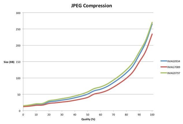
JPEG compression graph showing file size increases with higher quality for three images (IMAG0934, IMAG7089, IMAG9797).
GIF: The Veteran Format with Limitations
Graphics Interchange Format (GIF) represents one of the oldest web image formats, designed during the early days of the internet when technical constraints demanded creative solutions. GIF excels at compressing illustrations and graphics with large areas of uniform color, but it carries significant limitations that restrict its modern applications.[1]
The format’s most notable constraint is its restricted color palette of only 256 colors, which often produces pixelated and blocky results when applied to photographs. However, GIF supports transparency (though with rough edges) and remains the undisputed champion for creating animated graphics. Despite its age, GIF animations continue to be widely used across social media and messaging platforms.[5][6][1]
SVG: The Mathematical Marvel
Scalable Vector Graphics (SVG) represents a revolutionary approach to web graphics, functioning as a vector-based format rather than pixel-based imagery. Unlike traditional raster formats, SVG files contain mathematical instructions for drawing shapes, curves, and colors, enabling infinite scalability without quality loss.[1][7][8]
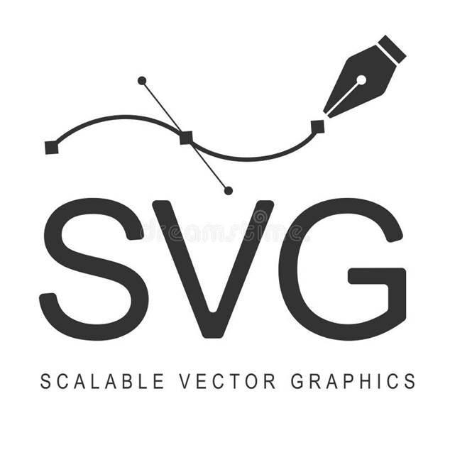
SVG logo with Bézier curve and pen illustrating scalable vector graphics
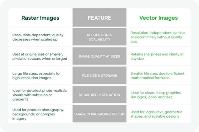
Comparison of raster and vector images showing their differences in resolution, scalability, file size, detail, and usage in design.
The advantages of SVG are particularly compelling for web developers. File sizes remain exceptionally small – often just a few kilobytes compared to megabytes for equivalent raster images. This mathematical approach makes SVG ideal for logos, icons, and illustrations that need to display clearly across different screen sizes and resolutions.[1][7][8]
SVG files are also SEO-friendly since they’re text-based and can include metadata that search engines can crawl. Additionally, they support CSS styling and JavaScript animations, enabling dynamic visual effects without compromising performance.[8][9]
JPEG: The Photography Standard
JPEG (Joint Photographic Experts Group) has established itself as the gold standard for photographic content on the web. This format employs lossy compression specifically optimized for images with complex color gradients and subtle tonal variations, making it ideal for photographs captured by digital cameras and smartphones.[1][2][6]
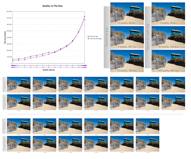
Comparison of JPEG and WebP image quality versus file size at various compression settings, illustrating optimization trade-offs for web images.
The key to effective JPEG implementation lies in proper optimization before web deployment. Raw camera files often measure several megabytes and thousands of pixels wide, making them unsuitable for direct web use. Professional optimization involves resizing images to appropriate display dimensions and applying compression settings that balance visual quality with file size efficiency.[2][3][10]
Modern JPEG compression can reduce file sizes significantly while maintaining acceptable visual quality, giving developers precise control over the quality-to-size ratio. However, pushing compression too far can introduce visible artifacts and pixelation.[11][2]
PNG: The Versatile All-Rounder
Portable Network Graphics (PNG) serves as a more modern alternative to both GIF and JPEG, offering advanced features that address many limitations of older formats. PNG’s primary strength lies in its support for high-quality transparency with smooth edges, making it essential for product cutouts, logos requiring transparent backgrounds, and layered visual designs.[1][6]
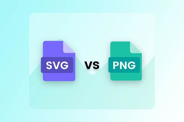
Comparison between SVG and PNG image file formats in web design.
The format demonstrates remarkable versatility, sometimes outperforming GIF for graphics with solid color blocks and occasionally achieving better compression than JPEG for photographs with simpler color schemes. PNG uses lossless compression, ensuring no quality degradation, though this typically results in larger file sizes compared to JPEG for photographic content.[1][2][6]
WebP: The Modern Game-Changer
WebP represents Google’s ambitious attempt to revolutionize web image formats by combining the strengths of JPEG, PNG, and GIF into a single, highly efficient solution. This modern format delivers superior compression performance, achieving 25-34% smaller file sizes than JPEG for comparable quality, and approximately 26% reduction compared to PNG for lossless compression.[1][11][12]
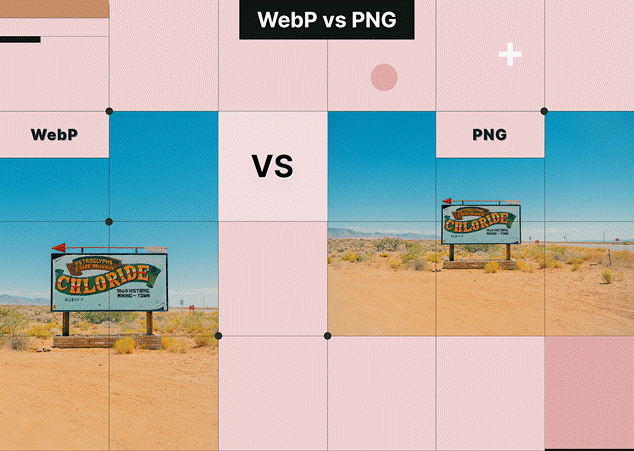
Comparison of WebP and PNG image formats showing the same photo to highlight visual differences for web use.
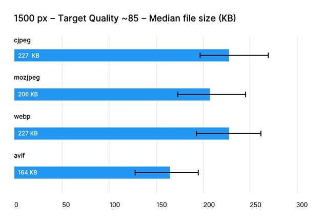
Comparison of median file sizes in KB for cjpeg, mozjpeg, webp, and avif formats at 1500px width and ~85 quality target.
WebP supports both lossy and lossless compression modes, transparency, and animation capabilities. For photographs, WebP’s lossy compression produces impressive results with significantly reduced file sizes. For graphics requiring transparency, the format offers lossless compression with alpha channel support, often creating smaller files than PNG equivalents.[1][12]
Browser support for WebP has reached critical mass, with 96% of internet users capable of viewing WebP images as of 2024. Major browsers including Chrome, Firefox, Edge, and Safari now support the format, though implementing fallback mechanisms for older browsers remains a best practice.[13][14][12][15]
Implementation Best Practices
Successfully implementing optimized image formats requires a strategic approach that considers both technical requirements and user experience. The HTML structure remains consistent across all formats, but the selection process should be methodical:[2][16][17]
For photographs and complex images: Choose JPEG for general use, with WebP as the preferred option when browser support allows[6][18]
For logos, icons, and simple graphics: SVG should be the primary choice due to scalability and minimal file sizes[1][7]
For images requiring transparency: PNG remains reliable, though WebP offers superior compression for modern browsers[12][1]
For simple animations: While GIF continues serving this purpose, WebP animation provides better quality at smaller file sizes[1][12]
Optimization Strategies
Effective image optimization extends beyond format selection to encompass comprehensive performance strategies. Key optimization techniques include:[2][10]
Responsive sizing: Deliver appropriately sized images based on device capabilities and display requirements[10][2]
Compression optimization: Use tools that automatically balance quality and file size, such as TinyPNG or automated server-side solutions[4][10]
Format testing: Compare multiple formats for each image to identify the most efficient option[17][2]
Progressive enhancement: Implement modern formats like WebP with fallbacks for older browsers using the HTML <picture> element[14]
Performance Impact and User Experience
Image optimization directly influences website performance metrics including page load times, bandwidth usage, and search engine rankings. Properly optimized images contribute to faster Largest Contentful Paint (LCP) scores and improved Core Web Vitals, which Google considers in search rankings.[2][17]
The cumulative effect of optimization becomes particularly significant for image-heavy websites. A single unoptimized image might seem inconsequential, but multiple large images can severely impact user experience, especially for mobile users on limited data plans.[17][2]
Future-Proofing Your Image Strategy
The landscape of web image formats continues evolving, with newer formats like AVIF showing promise for even better compression ratios. However, browser adoption and compatibility remain crucial considerations for practical implementation.[1][5]
Staying informed about emerging standards while maintaining reliable fallback solutions ensures websites remain accessible to all users while benefiting from the latest optimization technologies. The fundamental principles of balancing quality, performance, and compatibility will continue guiding effective image format decisions as web technologies advance.[14][1]
Modern web development demands a sophisticated understanding of image formats and their optimal applications. By matching the right format to specific content types and implementing comprehensive optimization strategies, developers can create visually stunning websites that load quickly and provide exceptional user experiences across all devices and connection speeds.
⁂
1. https://developer.mozilla.org/en-US/docs/Web/Media/Guides/Formats/Image_types
2. https://frontendmasters.com/blog/optimizing-images-for-web-performance/
3. https://elementor.com/blog/how-to-optimize-images/
4.
https://tinypng.com
5. https://developer.mozilla.org/en-US/docs/Web/HTML/Reference/Elements/img
6. https://themeisle.com/blog/best-image-format/
7. https://www.logome.ai/blogs/svg-vector-file-for-your-logo-design
8. https://www.svgator.com/blog/what-is-an-svg/
9. https://deliciousbrains.com/svg-advantages-developers/
10. https://uploadcare.com/blog/how-to-optimize-images-for-web-best-practice-guide/
11. https://developers.google.com/speed/webp/docs/webp_study
12. https://blog.tinify.com/pros-and-cons-webp-images/
13. https://www.lewebvert.fr/en/blog/2024-02-28-webp-compatibilite/
15. https://en.wikipedia.org/wiki/WebP
16. https://blog.rheinwerk-computing.com/important-image-formats-in-web-development
17. https://core.fiu.edu/blog/2023/optimizing-images-for-the-web.html
18. https://web.dev/articles/choose-the-right-image-format
19. https://www.svgator.com/blog/raster-vs-vector-which-is-best/
20. https://www.shutterstock.com/blog/raster-vs-vector-file-formats
21. https://www.geeksforgeeks.org/computer-graphics/vector-vs-raster-graphics/
22. https://atomisystems.com/elearning/vector-vs-raster-graphics/
23. https://www.digital.ink/blog/image-file-types/
24. https://www.adobe.com/ae_en/creativecloud/file-types/image/comparison/raster-vs-vector.html
25. https://www.pagecloud.com/blog/web-images-png-vs-jpg-vs-gif-vs-svg
26. https://web.dev/learn/performance/image-performance
27. https://www.reddit.com/r/webdev/comments/1bgqah5/at_what_point_are_vector_images_less_performant/
28. https://www.adobe.com/uk/creativecloud/photography/discover/image-optimisation.html
29. https://arxiv.org/pdf/2108.02557.pdf
30. https://photutorial.com/image-format-comparison-statistics/
31. https://github.com/WangXuan95/Image-Compression-Benchmark
32. https://qdos.digital/blog/benefits-using-svg-graphics
34. https://en.wikipedia.org/wiki/Image_compression
35. https://support.sana-commerce.com/content/sana-user-guide/Design-Layout/Themes/SVG-Icons.htm
36. https://www.reddit.com/r/astrojs/comments/1avlfka/is_it_okay_in_2024_to_ship_only_webp_images_and/
37. https://www.w3schools.com/graphics/svg_intro.asp
38. https://www.rumvision.com/blog/modern-image-formats-webp-avif-browser-support/


