
CSS Magic: Making Images Scale Perfectly Across All Devices

Modern web design demands images that look stunning on massive desktop displays while scaling beautifully on compact smartphone screens. CSS provides powerful, flexible solutions for this responsive design challenge, enabling a single image to adapt flawlessly across all device types and screen sizes.[1][2][3]
The Power of CSS Responsive Images
Responsive images automatically adjust their dimensions based on the viewing device, ensuring optimal display without compromising quality or performance. This approach eliminates the need for separate image files for different devices while maintaining visual excellence across all platforms.[4][5]
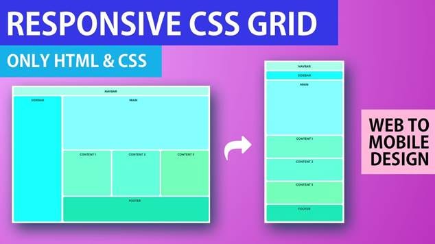
Responsive CSS grid layout adapting from desktop wide screen to mobile single-column view
Core CSS Properties for Image Scaling
Max-Width Property
The most fundamental technique uses the max-width property to create fluid, responsive images:[1][6]
img {
max-width: 100%;
height: auto;
}
This ensures images never exceed their container width while maintaining aspect ratio. The image scales down on smaller screens but never scales up beyond its original size, preventing pixelation.[7][6][8]
Width and Height Properties
For more control over image dimensions:[3][9]
img {
width: 100%;
height: auto;
}
This makes images fill their container completely, scaling both up and down as needed.[6][8]
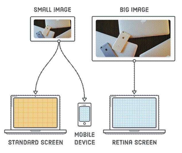
Responsive images adapt image size and resolution for standard, retina, and mobile screens.
Advanced CSS Techniques
Object-Fit Property
The object-fit property provides sophisticated control over how images fit within their containers:[9][10][11]
img {
width: 300px;
height: 200px;
object-fit: cover;
}
Key object-fit values:[10][11][12]
· cover: Scales image to fill container, cropping excess while maintaining aspect ratio
· contain: Scales image to fit within container without cropping
· fill: Stretches image to fill container exactly (may distort)
· scale-down: Uses the smaller of none or contain sizing
· none: Displays image at original size
Media Queries for Device-Specific Styling
CSS media queries enable different image treatments for various screen sizes:[2][5][13]
/* Mobile devices */
@media (max-width: 767px) {
img {
max-width: 100%;
height: auto;
}
}
/* Tablets */
@media (min-width: 768px) and (max-width: 1023px) {
img {
max-width: 80%;
height: auto;
}
}
/* Desktop */
@media (min-width: 1024px) {
img {
max-width: 60%;
height: auto;
}
}
Modern Image Format Implementation
WebP and AVIF Formats
Modern browsers support next-generation image formats that offer superior compression while maintaining quality:[14][15][16]
<picture>
<source srcset=”image.avif” type=”image/avif”>
<source srcset=”image.webp” type=”image/webp”>
<img src=”image.jpg” alt=”Fallback image”>
</picture>
AVIF provides 20-30% smaller file sizes compared to WebP, while WebP offers 25-34% smaller sizes than JPEG for equivalent quality.[15][17][14]
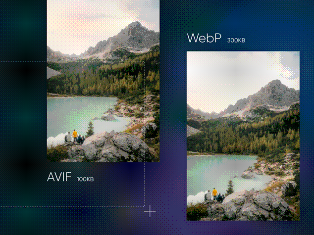
Comparison of AVIF and WebP image formats showing file size differences for the same landscape photo.
Performance Benefits
File Size Comparison
Modern image formats deliver significant performance improvements:[14][15][17]
· AVIF: Most efficient compression, 50% smaller than JPEG and 20-30% smaller than WebP
· WebP: Excellent compression with 25-34% smaller sizes than JPEG for equivalent quality
· JPEG: Traditional format with larger file sizes
· PNG: Best for images requiring transparency but larger files
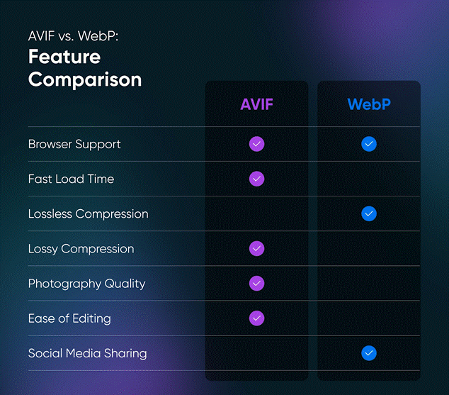
Comparison of AVIF and WebP image formats across key features such as compression and browser support.
Responsive Design Strategies
Mobile-First Approach
Starting with mobile designs and scaling up ensures optimal performance across all devices:[2][5][18]
/* Base mobile styles */
img {
max-width: 100%;
height: auto;
}
/* Tablet enhancement */
@media (min-width: 768px) {
img.hero {
max-width: 80%;
}
}
/* Desktop enhancement */
@media (min-width: 1024px) {
img.hero {
max-width: 60%;
}
}
Fluid Grid Systems
Combining responsive images with CSS Grid or Flexbox creates truly adaptive layouts:[5][2]
.image-grid {
display: grid;
grid-template-columns: repeat(auto-fit, minmax(300px, 1fr));
gap: 1rem;
}
.image-grid img {
width: 100%;
height: 200px;
object-fit: cover;
}
Advanced Responsive Techniques
Srcset and Sizes Attributes
HTML5 provides native responsive image support that can reduce bandwidth usage by up to 50% on mobile devices:[4][19][20]
<img src=”image-800w.jpg”
srcset=”image-400w.jpg 400w,
image-800w.jpg 800w,
image-1200w.jpg 1200w”
sizes=”(max-width: 600px) 400px,
(max-width: 900px) 800px,
1200px”
alt=”Responsive image”>
This approach serves different image resolutions based on device capabilities.[20][21]
Background Images with CSS
For decorative images, use CSS background properties:[4][20]
.hero-section {
background-image: url(‘hero-image.jpg’);
background-size: cover;
background-position: center;
height: 50vh;
}
@media (max-width: 768px) {
.hero-section {
background-image: url(‘hero-mobile.jpg’);
height: 30vh;
}
}
Performance Optimization
Lazy Loading
Implement lazy loading to improve initial page load times by approximately 25%:[20][21]
img {
loading: lazy;
max-width: 100%;
height: auto;
}
Image Compression
Optimize images before deployment:[4][20]
· Use compression tools to reduce file sizes by up to 70% without degrading visual fidelity
· Choose appropriate formats based on image content
· Implement modern formats like WebP and AVIF for better compression
Content Delivery Networks (CDNs)
Serve images from CDNs to reduce loading times and improve global performance.[21][4]
Best Practices for Implementation
1. Always Set Max-Width: Use max-width: 100% to prevent images from breaking container layouts[1][7][6]
2. Maintain Aspect Ratios: Set height: auto to preserve natural proportions[7][8]
3. Use Modern Formats: Implement WebP and AVIF with fallbacks to reduce file sizes by 30-50%[14][15][16]
4. Optimize File Sizes: Compress images appropriately for web delivery[20][21]
5. Test Across Devices: Verify responsive behavior on various screen sizes[2][18]
6. Consider Loading Performance: Use lazy loading and optimize critical path images[21][20]
Future-Proof Solutions
CSS continues evolving with new features like the aspect-ratio property that provides native aspect ratio control:[7]
img {
width: 100%;
aspect-ratio: 16/9;
object-fit: cover;
}
This ensures consistent proportions across all device sizes while maintaining responsive behavior.
Conclusion
CSS responsive images represent the perfect blend of technical capability and visual excellence. By leveraging properties like max-width, object-fit, and modern image formats, developers can create websites that deliver stunning visuals across all devices. The combination of CSS flexibility with HTML5 responsive features provides complete control over image scaling, ensuring optimal user experiences regardless of screen size or device type.[1][4][9][19][10]
These techniques transform the challenge of multi-device image display into an opportunity for enhanced user engagement and improved website performance. Studies show that mobile-friendly sites with optimized responsive images can lead to a 67% increase in the likelihood of purchases and improve conversion rates by up to 30%. When implemented correctly, responsive images contribute significantly to faster loading times, better SEO rankings, and superior user satisfaction across all platforms.[18][20]
⁂
1. https://www.w3schools.com/howto/howto_css_image_responsive.asp
2. https://www.geeksforgeeks.org/techtips/best-practices-and-considerations-for-responsive-web-design/
3. https://elementor.com/blog/resize-an-image-in-css/
4. https://claritee.io/blog/a-designers-definitive-guide-to-responsive-images/
5. https://webflow.com/blog/responsive-web-design
6. https://www.w3schools.com/css/css_rwd_images.asp
7. https://cloudinary.com/guides/image-effects/css-image-size
8. https://picsart.io/blog/editing-api/how-to-resize-image-in-html-css/
9. https://www.browserstack.com/guide/how-to-resize-image-using-css
10. https://www.geeksforgeeks.org/css/css-the-object-fit-property/
11. https://www.w3schools.com/cssref/css3_pr_object-fit.php
12. https://mimo.org/glossary/css/object-fit
13. https://www.interaction-design.org/literature/topics/responsive-design
14. https://www.rumvision.com/blog/modern-image-formats-webp-avif-browser-support/
15. https://crystallize.com/blog/avif-vs-webp
16. https://cloudinary.com/blog/advanced-image-formats-and-when-to-use-them
17. https://shortpixel.com/blog/avif-vs-webp/
18. https://www.webstacks.com/blog/mobile-website-design-best-practices
19. https://developer.mozilla.org/en-US/docs/Web/HTML/Guides/Responsive_images
20. https://moldstud.com/articles/p-best-practices-for-responsive-images-to-boost-frontend-performance
21. https://onenine.com/10-responsive-image-techniques-for-faster-websites/
22. https://blog.bitsrc.io/responsive-images-different-techniques-and-tactics-6045a1fa7ea2
23. https://www.browserstack.com/guide/responsive-design-breakpoints
24. https://developer.mozilla.org/en-US/docs/Web/CSS/image-rendering
25. https://web.dev/learn/design/responsive-images
26. https://www.designstudiouiux.com/blog/responsive-web-design-best-practices/
27. https://stackoverflow.com/questions/787839/resize-image-proportionally-with-css
28. https://ishadeed.com/article/image-techniques/
29. https://developer.mozilla.org/en-US/docs/Learn_web_development/Core/CSS_layout/Responsive_Design
30. https://web.dev/learn/performance/image-performance
31. https://www.w3schools.com/css/css3_object-fit.asp
32. https://www.wearediagram.com/blog/optimizing-images-better-web-performance
33. https://developer.mozilla.org/en-US/docs/Web/CSS/object-fit
34. https://developer.chrome.com/docs/lighthouse/performance/uses-webp-images
35. https://css-tricks.com/almanac/properties/o/object-fit/
36. https://www.smashingmagazine.com/2021/09/modern-image-formats-avif-webp/
37. https://dev.acquia.com/blog/image-optimization-oft-forgotten-crucial-performance-step
38. https://tailwindcss.com/docs/object-fit


