
रेस्पॉन्सिव इमेज डिज़ाइन: CSS का जादुई समाधान
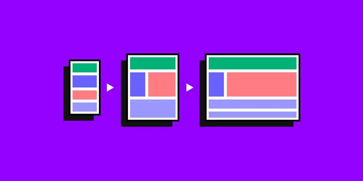
आजकल के डिजिटल युग में, लोग अलग-अलग साइज़ की स्क्रीन वाले डिवाइसेज का इस्तेमाल करते हैं – बड़े डेस्कटॉप मॉनिटर से लेकर छोटे स्मार्टफ़ोन तक। एक वेब डेवलपर और डिज़ाइनर के लिए सबसे बड़ी चुनौती यह है कि किसी भी इमेज या डिज़ाइन को हर साइज़ की स्क्रीन पर खूबसूरत और फ़ंक्शनल बनाया जाए।[1][2][3]
HTML img tag using srcset to deliver images in multiple resolutions for responsive design.
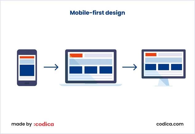
मोबाइल-फ़र्स्ट डिज़ाइन का महत्व
मोबाइल-फ़र्स्ट डिज़ाइन एक ऐसी रणनीति है जो छोटी स्क्रीन के लिए डिज़ाइन करने को प्राथमिकता देती है, फिर बड़ी स्क्रीन के लिए इसे बढ़ाती है। इस तरीके के कई फ़ायदे हैं:[4][5]
· बेहतर प्रदर्शन: छोटी इमेज फ़ाइलें तेज़ लोड होती हैं
· SEO लाभ: गूगल मोबाइल-फ़र्स्ट इंडेक्सिंग को प्राथमिकता देता है[5]
· यूज़र एक्सपीरियंस: मोबाइल यूज़र्स को बेहतर अनुभव मिलता है
Mobile-first design illustration showing UI adapting from mobile to larger screens.
CSS मीडिया क्वेरीज़ का जादू
मीडिया क्वेरीज़ CSS की एक शक्तिशाली तकनीक है जो अलग-अलग स्क्रीन साइज़ के लिए अलग-अलग स्टाइल लगाने की अनुमति देती है। इसका बेसिक सिंटैक्स इस प्रकार है:[6][7]
/* मोबाइल के लिए */
@media (max-width: 600px) {
.image {
width: 100%;
height: auto;
}
}
/* टैबलेट के लिए */
@media (min-width: 601px) and (max-width: 1024px) {
.image {
width: 80%;
max-width: 800px;
}
}
/* डेस्कटॉप के लिए */
@media (min-width: 1025px) {
.image {
width: 60%;
max-width: 1200px;
}
}
रेस्पॉन्सिव इमेज तकनीकें
1. बेसिक CSS प्रॉपर्टीज़
सबसे आसान तरीका max-width प्रॉपर्टी का इस्तेमाल करना है:[1][8]
img {
max-width: 100%;
height: auto;
}
यह इमेज को उसके कंटेनर से बड़ा नहीं बनने देता और अनुपात बनाए रखता है।
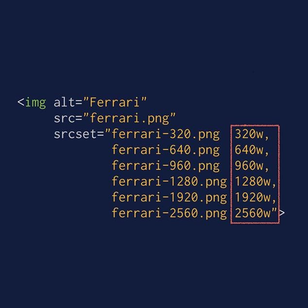
2. srcset और sizes एट्रिब्यूट्स
HTML5 में srcset और sizes एट्रिब्यूट्स अधिक एडवांसड कंट्रोल देते हैं:[9][10]
<img src=”image-default.jpg”
srcset=”image-480w.jpg 480w,
image-800w.jpg 800w,
image-1200w.jpg 1200w”
sizes=”(max-width: 600px) 480px,
(max-width: 1024px) 800px,
1200px”
alt=”रेस्पॉन्सिव इमेज का उदाहरण”>
3. Picture एलिमेंट
अधिक कंट्रोल के लिए <picture> एलिमेंट का इस्तेमाल करें:[11][12]
<picture>
<source media=”(min-width: 650px)” srcset=”image-desktop.jpg”>
<source media=”(min-width: 465px)” srcset=”image-tablet.jpg”>
<img src=”image-mobile.jpg” alt=”रेस्पॉन्सिव इमेज”>
</picture>
इमेज ऑप्टिमाइज़ेशन की महत्वपूर्ण तकनीकें
फ़ाइल फॉर्मेट का चुनाव
· JPEG: फ़ोटोग्राफ़ी के लिए बेस्ट[13][14]
· PNG: लोगो और टेक्स्ट के लिए उपयुक्त
· WebP: आधुनिक फॉर्मेट, बेहतर कम्प्रेशन[15][14]
कम्प्रेशन तकनीक
इमेज को कम्प्रेस करना बहुत ज़रूरी है ताकि फ़ाइल साइज़ कम हो जाए लेकिन क्वालिटी बनी रहे। TinyPNG जैसे टूल्स का इस्तेमाल करें।[13][16][17]
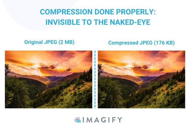
Comparison of original and compressed JPEG showing effective compression without visible quality loss
प्रैक्टिकल इम्प्लीमेंटेशन गाइड
स्टेप 1: कंटेंट प्राइऑरिटाइज़ेशन
सबसे पहले तय करें कि मोबाइल स्क्रीन पर क्या दिखाना सबसे ज़रूरी है।[5]
स्टेप 2: टच-फ्रेंडली इंटरफ़ेस
बटन और इंटरैक्टिव एलिमेंट्स को टच के लिए उपयुक्त बनाएं।[5]
स्टेप 3: ब्रेकपॉइंट्स सेट करना
2025 के लिए सुझाए गए ब्रेकपॉइंट्स:[18][19]
/* मोबाइल फर्स्ट */
.container {
width: 100%;
}
/* छोटे टैबलेट */
@media (min-width: 576px) {
.container {
max-width: 540px;
}
}
/* बड़े टैबलेट */
@media (min-width: 768px) {
.container {
max-width: 720px;
}
}
/* डेस्कटॉप */
@media (min-width: 1200px) {
.container {
max-width: 1140px;
}
}
परफ़ॉर्मेंस ऑप्टिमाइज़ेशन
Lazy Loading
इमेजेज़ को तभी लोड करें जब वे ज़रूरी हों:[20]
<img src=”image.jpg” loading=”lazy” alt=”डिस्क्रिप्शन”>
CDN का इस्तेमाल
कंटेंट डिलीवरी नेटवर्क इमेजेज़ को तेज़ी से लोड करने में मदद करता है।[15]
टेस्टिंग और डिबगिंग
अलग-अलग डिवाइसेज पर अपनी रेस्पॉन्सिव डिज़ाइन को टेस्ट करना बहुत ज़रूरी है। BrowserStack जैसे टूल्स का इस्तेमाल करके रियल डिवाइसेज पर टेस्ट करें।[13][16]
भविष्य की तकनीकें
आने वाले समय में Container Queries और AVIF फॉर्मेट जैसी नई तकनीकें रेस्पॉन्सिव इमेज डिज़ाइन को और भी बेहतर बनाएंगी।[15][18]
निष्कर्ष: CSS की मदद से रेस्पॉन्सिव इमेज डिज़ाइन करना वास्तव में एक कला है। सही तकनीकों का इस्तेमाल करके आप एक ही इमेज को हर डिवाइस पर परफ़ेक्ट दिखा सकते हैं। मोबाइल-फ़र्स्ट अप्रोच अपनाएं, मीडिया क्वेरीज़ का सही इस्तेमाल करें, और अपने यूज़र्स को बेस्ट एक्सपीरियंस दें।
⁂
1. https://www.w3schools.com/howto/howto_css_image_responsive.asp
2. https://www.mightybytes.com/blog/optimizing-images-for-responsive-design/
3. https://web.dev/articles/optimize-css-background-images-with-media-queries
4. https://www.browserstack.com/guide/how-to-implement-mobile-first-design
5. https://www.qatouch.com/blog/mobile-first-design/
6. https://developer.mozilla.org/en-US/docs/Web/CSS/CSS_media_queries/Using_media_queries
7. https://www.w3schools.com/css/css3_mediaqueries_ex.asp
8. https://www.w3schools.com/css/css_rwd_images.asp
9. https://www.leohuynh.dev/blog/better-responsive-image-with-srcset-and-sizes-attributes
10. https://uploadcare.com/blog/srcset-images/
11. https://css-tricks.com/a-guide-to-the-responsive-images-syntax-in-html/
12. https://www.w3schools.com/html/html_images_picture.asp
13. https://www.browserstack.com/guide/strategies-for-optimizing-images-for-mobile
14. https://www.shopify.com/blog/7412852-10-must-know-image-optimization-tips
15. https://claritee.io/blog/a-designers-definitive-guide-to-responsive-images/
16. https://www.outerboxdesign.com/articles/digital-marketing/optimizing-images-for-mobile/
17.
https://tinypng.com
18. https://blog.logrocket.com/css-breakpoints-responsive-design/
19. https://dev.to/gerryleonugroho/responsive-design-breakpoints-2025-playbook-53ih
20. https://elementor.com/blog/how-to-optimize-images/
21. https://www.wearediagram.com/blog/optimizing-images-better-web-performance
23. https://blog.bitsrc.io/responsive-images-different-techniques-and-tactics-6045a1fa7ea2
24. https://www.liquidweb.com/blog/optimizing-images-for-responsive-design/
25. https://developer.mozilla.org/en-US/docs/Web/HTML/Guides/Responsive_images
26. https://bowwe.com/tutorial/image-optimization
27. https://stackoverflow.com/questions/39844317/media-queries-make-images-responsive
28. https://web.dev/learn/design/responsive-images
29. https://www.debugbear.com/blog/responsive-images
30. https://www.w3schools.com/css/css_rwd_mediaqueries.asp
31. https://ishadeed.com/article/image-techniques/
32. https://webflow.com/blog/image-optimization-for-web
33. https://www.keycdn.com/blog/responsive-images
34. https://developer.mozilla.org/en-US/docs/Web/HTML/Reference/Elements/picture
35. https://www.tekrevol.com/blogs/guide-to-mobile-first-responsive-web-design/
36. https://amp.dev/documentation/guides-and-tutorials/develop/style_and_layout/art_direction/
37. https://www.uxpin.com/studio/blog/a-hands-on-guide-to-mobile-first-design/
38.
39. https://www.adobe.com/uk/express/learn/blog/designing-mobile-first-content
40. https://web.dev/learn/design/picture-element
42. https://dev.to/razbakov/responsive-images-best-practices-in-2025-4dlb
43. https://www.w3schools.com/tags/tag_picture.asp
44.
45. https://penpot.app/blog/how-to-use-css-and-media-query-breakpoints-to-create-responsive-layouts/
46.
47.
48.
49. https://web.dev/learn/performance/image-performance
51.
52.
53. https://wpengine.com/resources/optimize-images-for-web/
54. https://www.browserstack.com/guide/responsive-design-breakpoints
55.
56. https://www.reddit.com/r/webdev/comments/sqzvc7/website_and_image_optimization/


