
CSS দিয়ে অতি সুন্দর রেসপন্সিভ ইমেজ তৈরি করুন
রেসপন্সিভ ইমেজ ডিজাইনের ক্ষেত্রে CSS হল আপনার সবচেয়ে শক্তিশালী অস্ত্র। একটি একক ইমেজ ফাইল থেকে শুরু করে, আপনি এমন একটি সিস্টেম তৈরি করতে পারেন যা বড় ডেস্কটপ মনিটর থেকে শুরু করে ছোট স্মার্টফোন স্ক্রিন পর্যন্ত সব ডিভাইসে নিখুঁতভাবে কাজ করবে।[1][2][3]
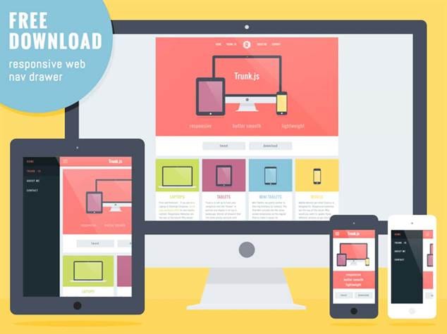
Responsive web design example showing the same interface adapting to desktop, tablet, and smartphone screens smoothly.
CSS এর মৌলিক পদ্ধতি: Width এবং Height Properties
রেসপন্সিভ ইমেজ তৈরির সবচেয়ে সহজ এবং কার্যকর উপায় হল CSS এর width এবং height properties ব্যবহার করা। এই পদ্ধতিটি অত্যন্ত সহজ কিন্তু শক্তিশালী:[4][5]
img {
width: 100%;
height: auto;
}
এই কোডটি ইমেজকে তার কন্টেইনারের ১০০% প্রস্থে প্রদর্শন করবে এবং উচ্চতা স্বয়ংক্রিয়ভাবে সামঞ্জস্য করবে। ফলে ইমেজের মূল অনুপাত (aspect ratio) অক্ষুণ্ণ থাকবে।[6]
Max-Width দিয়ে উন্নত নিয়ন্ত্রণ
আরো ভালো সমাধানের জন্য max-width property ব্যবহার করুন:[2][4]
img {
max-width: 100%;
height: auto;
}
max-width: 100% নিশ্চিত করে যে ইমেজটি কখনই তার কন্টেইনার থেকে বড় হবে না[6]। বড় স্ক্রিনে এটি ইমেজের মূল সাইজ বজায় রাখবে, কিন্তু ছোট স্ক্রিনে স্কেল ডাউন করবে।
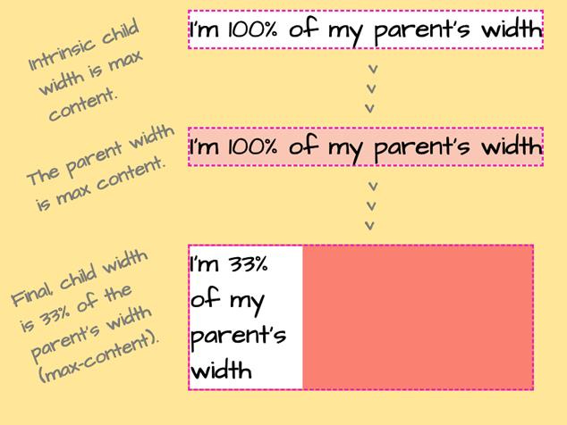
Demonstration of CSS width behavior showing intrinsic, parent, and percentage-based child widths.
Object-fit Property: আধুনিক সমাধান
CSS এর object-fit property হল রেসপন্সিভ ইমেজ ডিজাইনের জন্য একটি অত্যন্ত শক্তিশালী টুল। এটি নির্ধারণ করে যে একটি ইমেজ তার কন্টেইনারে কীভাবে ফিট হবে।[7][8][9]
Object-fit এর বিভিন্ন মান
Cover মান:
img {
width: 100%;
height: 300px;
object-fit: cover;
}
object-fit: cover ইমেজকে কন্টেইনারের পুরো এলাকা পূরণ করবে, প্রয়োজনে ইমেজের কিছু অংশ কেটে ফেলবে, কিন্তু অনুপাত ঠিক রাখবে[7][8]।
Contain মান:
img {
width: 100%;
height: 300px;
object-fit: contain;
}
object-fit: contain পুরো ইমেজটি কন্টেইনারের মধ্যে দৃশ্যমান রাখবে, প্রয়োজনে পাশে ফাঁকা জায়গা রেখে[7][8]।
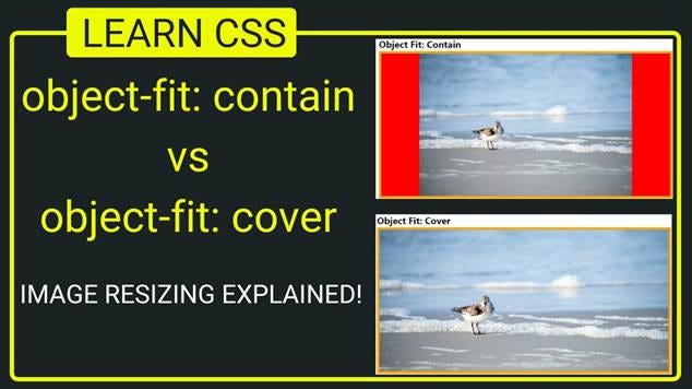
Illustration showing the difference between CSS object-fit: contain and object-fit: cover on image resizing.
HTML Picture Element: চূড়ান্ত নমনীয়তা
<picture> element হল HTML5 এর একটি অসাধারণ ফিচার যা বিভিন্ন ডিভাইসের জন্য বিভিন্ন ইমেজ সরবরাহ করতে পারে[3][10][11]:
<picture>
<source media=”(min-width: 800px)” srcset=”large-image.jpg”>
<source media=”(min-width: 400px)” srcset=”medium-image.jpg”>
<img src=”small-image.jpg” alt=”বর্ণনা”>
</picture>
এই পদ্ধতিতে বড় স্ক্রিনে (৮০০px+) large-image.jpg, মাঝারি স্ক্রিনে (৪০০px+) medium-image.jpg এবং ছোট স্ক্রিনে small-image.jpg প্রদর্শিত হবে।[11]
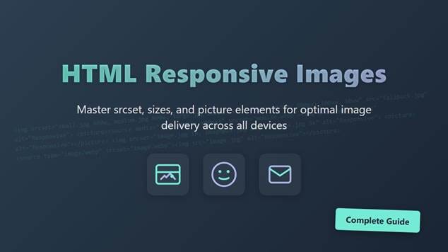
An educational banner illustrating key HTML elements for responsive images to optimize delivery across devices.
Srcset Attribute: পারফরম্যান্স অপটিমাইজেশন
srcset attribute ব্যবহার করে আপনি বিভিন্ন রেজোলিউশনের জন্য বিভিন্ন সাইজের ইমেজ সরবরাহ করতে পারেন[10][12]:
<img srcset=”image-320w.jpg 320w,
image-480w.jpg 480w,
image-800w.jpg 800w”
sizes=”(max-width: 320px) 280px,
(max-width: 480px) 440px,
800px”
src=”image-800w.jpg”
alt=”বর্ণনা”>
এই পদ্ধতি ৭০-৯০% পর্যন্ত ডেটা সেভিং এনে দিতে পারে।[10]
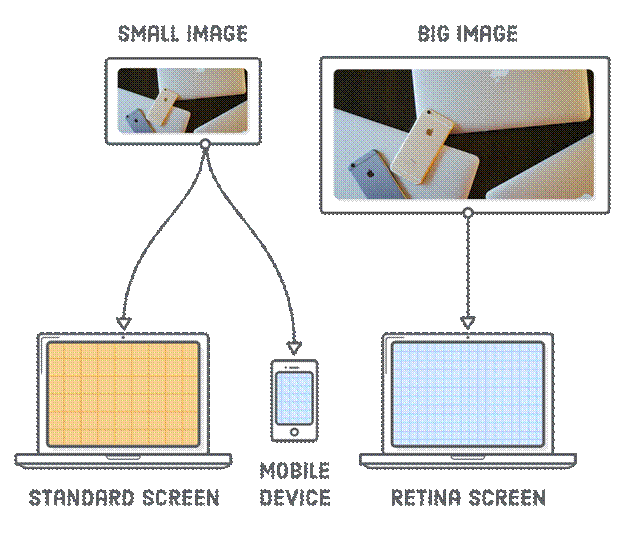
Diagram illustrating how responsive images scale smoothly across standard, mobile, and Retina screens using different image sizes.
Background Images এর জন্য রেসপন্সিভ কৌশল
CSS background images এর জন্যও রেসপন্সিভ সমাধান রয়েছে:[13][6]
Background-size: Cover
.hero-section {
background-image: url(‘hero-image.jpg’);
background-size: cover;
background-position: center;
height: 500px;
}
Background-size: Contain
.logo-container {
background-image: url(‘logo.png’);
background-size: contain;
background-repeat: no-repeat;
background-position: center;
}
background-size: cover পুরো কন্টেইনার পূরণ করে এবং contain পুরো ইমেজ দৃশ্যমান রাখে[6]।
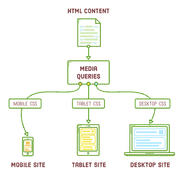
Flowchart illustrating how CSS media queries adapt HTML content with different CSS for mobile, tablet, and desktop devices to create responsive sites.
Media Queries: ডিভাইস-নির্দিষ্ট স্টাইলিং
Media queries ব্যবহার করে বিভিন্ন স্ক্রিন সাইজের জন্য আলাদা স্টাইল প্রয়োগ করতে পারেন:[13]
/* মোবাইল ডিভাইস */
@media (max-width: 768px) {
img {
max-width: 100%;
height: auto;
margin: 10px 0;
}
}
/* ট্যাবলেট */
@media (min-width: 769px) and (max-width: 1024px) {
img {
max-width: 80%;
margin: 15px auto;
display: block;
}
}
/* ডেস্কটপ */
@media (min-width: 1025px) {
img {
max-width: 60%;
margin: 20px auto;
display: block;
}
}
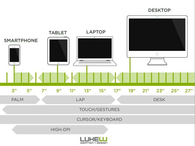
Illustration of device screen sizes and input types for responsive design, from smartphone to desktop.
পারফরম্যান্স অপটিমাইজেশন কৌশল
সঠিক ইমেজ ফরম্যাট নির্বাচন
· JPEG: ফটোগ্রাফের জন্য
· PNG: লোগো এবং গ্রাফিক্সের জন্য
· WebP: আধুনিক ব্রাউজারের জন্য সর্বোত্তম কম্প্রেশন
Lazy Loading প্রয়োগ
<img src=”image.jpg” alt=”বর্ণনা” loading=”lazy”>
এই কৌশল পেজ লোডিং স্পিড উল্লেখযোগ্যভাবে বৃদ্ধি করে।[14]
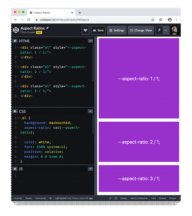
Demonstration of CSS aspect-ratio property controlling element sizes for responsive design.
সেরা অনুশীলন
Alt Text এবং Accessibility
<img src=”image.jpg” alt=”ইমেজের সুস্পষ্ট বর্ণনা”>
Intrinsic Sizing
<img src=”image.jpg” alt=”বর্ণনা” width=”800″ height=”600″>
CSS Grid এবং Flexbox এর সাথে সমন্বয়
.gallery {
display: grid;
grid-template-columns: repeat(auto-fit, minmax(250px, 1fr));
gap: 20px;
}
.gallery img {
width: 100%;
height: 200px;
object-fit: cover;
border-radius: 8px;
}
সাধারণ ভুল এড়ানো
ভুল পদ্ধতি:
img {
width: 500px;
height: 300px;
}
সঠিক পদ্ধতি:
img {
max-width: 100%;
height: auto;
}
Fixed dimensions ব্যবহার করলে রেসপন্সিভনেস নষ্ট হয়ে যায়। সর্বদা relative units এবং flexible properties ব্যবহার করুন।[15][16]
CSS এর মাধ্যমে রেসপন্সিভ ইমেজ তৈরি করা আধুনিক ওয়েব ডেভেলপমেন্টের একটি অপরিহার্য দক্ষতা। max-width: 100% থেকে শুরু করে আধুনিক object-fit, picture element, এবং srcset পর্যন্ত—এই সব কৌশল একসাথে ব্যবহার করে আপনি এমন ওয়েবসাইট তৈরি করতে পারবেন যা সব ডিভাইসে নিখুঁতভাবে কাজ করবে।[1][2][3]
রেসপন্সিভ ডিজাইন শুধু ইমেজ সাইজ পরিবর্তন করা নয়—এটি ব্যবহারকারীর অভিজ্ঞতা উন্নত করার বিষয়। সঠিক কৌশল প্রয়োগ করে আপনি নিশ্চিত করতে পারেন যে আপনার কন্টেন্ট সব ধরনের স্ক্রিনে দেখতে দুর্দান্ত লাগবে।
⁂
1. https://www.linkedin.com/pulse/most-useful-css-techniques-create-responsive-images-shorif-patwary
2. https://elementor.com/blog/resize-an-image-in-css/
3. https://developer.mozilla.org/en-US/docs/Web/HTML/Guides/Responsive_images
4. https://www.w3schools.com/howto/howto_css_image_responsive.asp
5. https://www.browserstack.com/guide/how-to-resize-image-using-css
6. https://www.w3schools.com/css/css_rwd_images.asp
7. https://www.w3schools.com/cssref/css3_pr_object-fit.php
8. https://www.w3schools.com/css/css3_object-fit.asp
9. https://mimo.org/glossary/css/object-fit
10. https://css-tricks.com/a-guide-to-the-responsive-images-syntax-in-html/
11. https://www.w3schools.com/html/html_images_picture.asp
12. https://blog.openreplay.com/create-stunning-responsive-images-with-the-picture-element/
13. https://designmodo.com/responsive-design-examples/
14. https://www.lambdatest.com/blog/how-to-make-responsive-images-with-css-html-wordpress-more/
15. https://stackoverflow.com/questions/11736363/responsive-images-with-css
16. https://picsart.io/blog/editing-api/how-to-resize-image-in-html-css/
17. https://cloudinary.com/guides/image-effects/css-image-size
18. https://www.freepik.com/free-photos-vectors/responsive-web-design
19.
20. https://unsplash.com/s/photos/responsive
22. https://developer.mozilla.org/en-US/docs/Web/CSS/image-rendering
23. https://stock.adobe.com/search?k=responsive+website
24. https://github.com/CodeJogot/html-css-course-in-bangla
25. https://www.istockphoto.com/photos/responsive-design
26.
27. https://stackoverflow.com/questions/787839/resize-image-proportionally-with-css
28.
29. https://www.linkedin.com/learning/html-essential-training-22425519/responsive-images-with-picture
30. https://www.geeksforgeeks.org/css/css-the-object-fit-property/
31.
32. https://blog.hubspot.com/website/css-object-fit
33.
34. https://developer.mozilla.org/en-US/docs/Web/CSS/object-fit
35. https://web.dev/learn/design/picture-element
36.


