
HTML Image Optimization: Creating Responsive Images for Every Screen
Modern websites must serve images efficiently across a vast array of devices, from small smartphones to large desktop monitors. HTML provides powerful tools to deliver the right image for each screen size, ensuring optimal quality and performance. This comprehensive guide explores how to implement responsive images using HTML’s srcset attribute and related techniques.
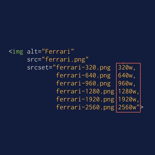
HTML code example showing the use of srcset attribute to provide multiple image resolutions for responsive loading.
Understanding Responsive Images
Responsive images automatically adapt to different screen sizes and resolutions without requiring manual intervention from users. The core principle involves creating multiple versions of the same image at different dimensions and letting the browser select the most appropriate version based on the device’s capabilities.[1][2]
This approach solves several critical problems. High-resolution images can be unnecessarily large for small screens, leading to slower load times and increased data usage. Conversely, small images may appear pixelated on larger, high-resolution displays. By providing multiple options, we achieve the perfect balance between visual quality and performance.[3][2]
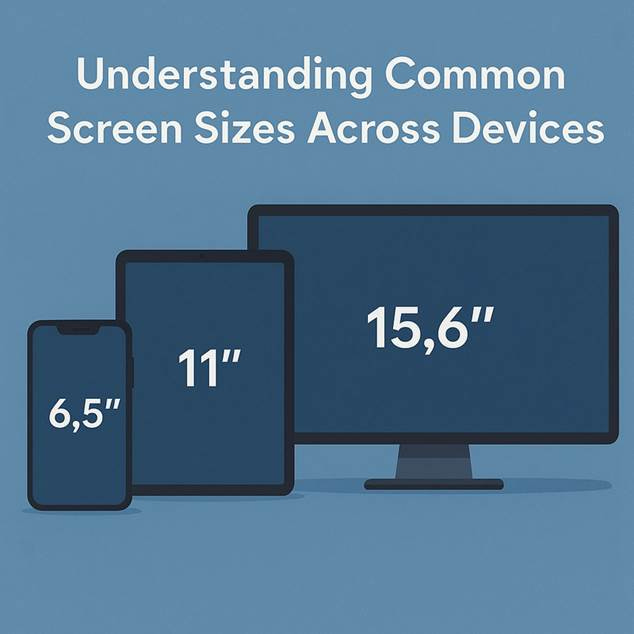
Common screen sizes for smartphone, tablet, and desktop monitor displayed in inches.
The srcset Attribute Fundamentals
The srcset attribute serves as the foundation for responsive image implementation in HTML. It allows developers to specify multiple image sources with different resolutions or widths, enabling browsers to make intelligent decisions about which image to download.[1][4]
Basic HTML Structure
Begin with a standard image tag that includes essential attributes:
<img src=”image-default.jpg”
alt=”Descriptive text for accessibility”
width=”800″
height=”600″>
The width and height attributes help browsers reserve the correct space before the image loads, preventing layout shifts and improving user experience.[3]
Implementing Width-Based Descriptors
Width descriptors (w) tell the browser about the intrinsic width of each image file, allowing it to calculate which version best matches the current viewport.[2][4]
<img src=”image-480w.jpg”
srcset=”image-480w.jpg 480w,
image-800w.jpg 800w,
image-1200w.jpg 1200w,
image-1920w.jpg 1920w”
sizes=”(max-width: 600px) 480px,
(max-width: 1024px) 800px,
1200px”
alt=”Responsive image example”
width=”1200″
height=”800″>
The sizes attribute works alongside srcset to inform the browser about how large the image will be displayed at different viewport widths. This information helps the browser select the most appropriate image from the source set.[5][2]
Resolution-Based Descriptors
For situations where you want to serve different image resolutions based on screen density, use pixel density descriptors (x):[2][4]
<img src=”image-1x.jpg”
srcset=”image-1x.jpg 1x,
image-1.5x.jpg 1.5x,
image-2x.jpg 2x,
image-3x.jpg 3x”
alt=”High-resolution image example”
width=”600″
height=”400″>
This approach proves particularly valuable for devices with high pixel density displays, such as Retina screens, where a 2x image provides the necessary sharpness.[6][2]
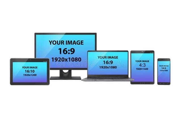
Various digital devices showing different screen aspect ratios and resolutions for image optimization.
Advanced Implementation with Picture Element
The <picture> element provides even greater control over image selection, especially useful for art direction scenarios where you might want to show entirely different images for different screen sizes:[6][7]
<picture>
<source media=”(max-width: 480px)”
srcset=”image-mobile-400.jpg 1x,
image-mobile-800.jpg 2x”>
<source media=”(max-width: 1024px)”
srcset=”image-tablet-800.jpg 1x,
image-tablet-1600.jpg 2x”>
<source media=”(min-width: 1025px)”
srcset=”image-desktop-1200.jpg 1x,
image-desktop-2400.jpg 2x”>
<img src=”image-default.jpg”
alt=”Fallback image for unsupported browsers”
width=”1200″
height=”800″>
</picture>
CSS Media Queries for Background Images
While HTML handles foreground images excellently, CSS media queries remain essential for responsive background images:[8][9]
.hero-section {
background-size: cover;
background-position: center;
background-repeat: no-repeat;
}
@media (max-width: 480px) {
.hero-section {
background-image: url(‘hero-mobile.jpg’);
}
}
@media (min-width: 481px) and (max-width: 1024px) {
.hero-section {
background-image: url(‘hero-tablet.jpg’);
}
}
@media (min-width: 1025px) {
.hero-section {
background-image: url(‘hero-desktop.jpg’);
}
}
Performance Optimization Techniques
Lazy Loading Implementation
Modern browsers support native lazy loading, which defers image loading until they enter the viewport:[10][11]
<img src=”image.jpg”
srcset=”image-480w.jpg 480w,
image-800w.jpg 800w,
image-1200w.jpg 1200w”
sizes=”(max-width: 768px) 100vw, 50vw”
loading=”lazy”
alt=”Lazy loaded responsive image”>
Image Format Selection
Combine responsive sizing with modern image formats for maximum efficiency:[6]
<picture>
<source type=”image/avif”
srcset=”image.avif 1x, image-2x.avif 2x”>
<source type=”image/webp”
srcset=”image.webp 1x, image-2x.webp 2x”>
<img src=”image.jpg”
srcset=”image.jpg 1x, image-2x.jpg 2x”
alt=”Modern format responsive image”>
</picture>
Best Practices for Implementation
Image Size Planning
Create images at strategic breakpoints that align with your responsive design:[10][6]
· Mobile: 480px, 640px
· Tablet: 768px, 1024px
· Desktop: 1200px, 1600px, 1920px
Quality vs. File Size Balance
Each image resolution should be optimized for its intended use case. Smaller images can tolerate higher compression since visual artifacts are less noticeable at reduced sizes.[10][6]
Testing Across Devices
Browser developer tools allow you to simulate different device conditions and verify that appropriate images load for each scenario. Test various network conditions to ensure images load efficiently across different connection speeds.[1][2]
Common Implementation Challenges
Bandwidth Considerations
While responsive images optimize for device capabilities, consider data usage implications. Implement loading strategies that respect user preferences and connection quality.[3][10]
Browser Compatibility
Although modern browsers widely support responsive image features, always include fallback options in your <img> tags to ensure compatibility with older browsers.[7][11]
Measuring Success
Monitor your responsive image implementation using web performance tools. Key metrics include:
· Largest Contentful Paint (LCP) improvements
· Reduced data transfer
· Faster page load times
Implementing responsive images represents one of the most impactful optimizations for modern web performance. By providing browsers with multiple image options and clear instructions about when to use each one, you ensure that every user receives the best possible experience regardless of their device or connection quality. The investment in creating multiple image versions pays dividends through improved performance, reduced bandwidth usage, and enhanced user satisfaction across all screen sizes.
⁂
1. https://www.debugbear.com/blog/responsive-images
2. https://uploadcare.com/blog/srcset-images/
3. https://www.industrialempathy.com/posts/image-optimizations/
4. https://www.dhiwise.com/post/mastering-srcset-html-for-responsive-images-a-practical-guide
6. https://web.dev/learn/performance/image-performance
7. https://developer.mozilla.org/en-US/docs/Web/HTML/Guides/Responsive_images
9. https://web.dev/articles/optimize-css-background-images-with-media-queries
10. https://elementor.com/blog/how-to-optimize-images/
11. https://www.builder.io/blog/fast-images
12. https://developer.mozilla.org/en-US/docs/Web/CSS/CSS_media_queries/Using_media_queries
13.
14. https://stackoverflow.com/questions/39844317/media-queries-make-images-responsive
15. https://www.w3schools.com/css/css3_mediaqueries_ex.asp
17. https://developer.mozilla.org/en-US/docs/Learn_web_development/Extensions/Performance/HTML
18. https://www.w3schools.com/css/css_rwd_mediaqueries.asp
19. https://css-tricks.com/a-guide-to-the-responsive-images-syntax-in-html/
20. https://www.hostinger.com/tutorials/complete-guide-to-image-optimization


