





अलग-अलग स्क्रीन के लिए इमेज ऑप्टिमाइज़ेशन
आज के डिजिटल युग में वेबसाइट्स और ऐप्स को विभिन्न प्रकार के डिवाइसेस पर सही तरीके से दिखना ज़रूरी है। स्मार्टफोन से लेकर डेस्कटॉप तक, हर स्क्रीन का अपना रिज़ॉल्यूशन और साइज़ होता है। इसी चुनौती को हल करने के लिए रेस्पॉन्सिव इमेज तकनीक का इस्तेमाल किया जाता है।[1][2]

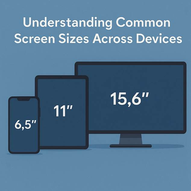
Common screen sizes for smartphone, tablet, and desktop monitor

Different digital devices showing various screen sizes, aspect ratios, and resolutions for optimized image handling.
रेस्पॉन्सिव इमेज क्यों ज़रूरी हैं?
जब आप किसी वेबसाइट पर एक ही इमेज सभी डिवाइसेस के लिए उपयोग करते हैं, तो कई समस्याएं आती हैं:[3][4]
· अनावश्यक डेटा खर्च: मोबाइल पर 4000px चौड़ी इमेज लोड करना फिजूलखर्ची है
· धीमी लोडिंग: बड़ी इमेज फाइल्स से पेज की स्पीड घटती है
· खराब यूज़र एक्सपीरियंस: यूज़र्स इंतज़ार नहीं करना चाहते
मल्टी-रिज़ॉल्यूशन रणनीति
सबसे प्रभावी तरीका यह है कि हर इमेज के कई वर्ज़न तैयार करें:[1][2]
विभिन्न साइज़ बनाना
· 320px: छोटे मोबाइल डिवाइसेस के लिए
· 640px: मध्यम साइज़ के फोन और टैबलेट्स के लिए
· 1024px: लैपटॉप और डेस्कटॉप के लिए
· 1920px: हाई-रिज़ॉल्यूशन डिस्प्ले के लिए
HTML में srcset का उपयोग
<img
src=”image-640.jpg”
srcset=”image-320.jpg 320w,
image-640.jpg 640w,
image-1024.jpg 1024w,
image-1920.jpg 1920w”
sizes=”(max-width: 600px) 100vw,
(max-width: 1024px) 50vw,
33vw”
alt=”रेस्पॉन्सिव इमेज उदाहरण”>
ब्राउज़र का स्मार्ट चुनाव
आधुनिक ब्राउज़र्स कई फैक्टर्स को देखकर सबसे उपयुक्त इमेज चुनते हैं:[5][6]
डिवाइस पिक्सेल रेश्यो (DPR)
· 1x: सामान्य डिस्प्ले (96 PPI)
· 2x: रेटिना डिस्प्ले (192 PPI)
· 3x: हाई-एंड स्मार्टफोन्स
· 4x: प्रीमियम डिस्प्ले
नेटवर्क की स्थिति
· तेज़ WiFi: उच्च गुणवत्ता वाली इमेज
· धीमा 3G: कंप्रेस्ड वर्ज़न
· डेटा सेवर मोड: सबसे छोटी फाइल
इमेज ऑप्टिमाइज़ेशन तकनीकें
फाइल फॉर्मेट का चुनाव
· JPEG: फोटो और कॉम्प्लेक्स इमेज के लिए
· PNG: ग्राफिक्स और ट्रांसपैरेंसी के लिए
· WebP: आधुनिक ब्राउज़र्स में बेहतर कंप्रेशन
· AVIF: अत्याधुनिक फॉर्मेट, सबसे छोटी फाइल साइज़
कंप्रेशन रणनीति
आप फाइल साइज़ को 80% तक कम कर सकते हैं बिना गुणवत्ता खोए:[8][7]

Comparison of various image formats based on file size compression ratio relative to PNG.
Picture Element का उपयोग
<picture>
<source media=”(min-width: 800px)” srcset=”large-image.webp” type=”image/webp”>
<source media=”(min-width: 400px)” srcset=”medium-image.webp” type=”image/webp”>
<img src=”small-image.jpg” alt=”वैकल्पिक छवि”>
</picture>
मोबाइल के लिए विशेष तकनीकें
स्मार्ट क्रॉपिंग
मोबाइल स्क्रीन पर इमेज के सबसे महत्वपूर्ण हिस्से को फोकस करना:[9][7]

Smartphone showing an Android home screen with app icons, illustrating a device with varying screen resolutions.
लेज़ी लोडिंग
<img src=”image.jpg” loading=”lazy” alt=”विवरण”>
यह तकनीक केवल तब इमेज लोड करती है जब यूज़र स्क्रॉल करके उस तक पहुंचता है।[10][7]
परफॉर्मेंस के फायदे
रेस्पॉन्सिव इमेज से मिलने वाले लाभ:[3][4]
· पेज स्पीड में 50-80% सुधार
· डेटा उपयोग में 60% की कमी
· बेहतर SEO रैंकिंग
· उच्च कन्वर्जन रेट
प्रैक्टिकल टिप्स
डेवलपर्स के लिए
1. हमेशा alt टेक्स्ट जोड़ें
2. width और height एट्रिब्यूट्स दें
3. इमेज CDN का उपयोग करें
4. रेगुलर ऑडिट करते रहें
बेस्ट प्रैक्टिसेज
· मोबाइल के लिए 640px तक का साइज़ पर्याप्त है
· WebP फॉर्मेट को प्राथमिकता दें
· फाइल साइज़ 100KB से कम रखने की कोशिश करें
भविष्य की तकनीकें
आने वाले समय में AI-पावर्ड ऑप्टिमाइज़ेशन और AVIF फॉर्मेट का व्यापक उपयोग होगा। ये तकनीकें अपने आप यूज़र के डिवाइस, कनेक्शन स्पीड और प्राथमिकताओं के अनुसार सबसे बेहतर इमेज चुनेंगी।[7]
निष्कर्ष
रेस्पॉन्सिव इमेज तकनीक आज की डिजिटल दुनिया में अत्यंत महत्वपूर्ण है। सही तरीके से लागू करने पर यह न केवल यूज़र एक्सपीरियंस बेहतर बनाती है बल्कि डेटा की बचत और तेज़ लोडिंग भी सुनिश्चित करती है। हर डेवलपर और वेब डिज़ाइनर को इन तकनीकों की जानकारी होना आवश्यक है।
मुख्य बात यह है कि ब्राउज़र को विकल्प देकर हम यूज़र्स को सबसे बेहतर अनुभव प्रदान कर सकते हैं, चाहे वे किसी भी डिवाइस या नेटवर्क का उपयोग कर रहे हों।
⁂
1. https://www.debugbear.com/blog/responsive-images
2. https://uploadcare.com/blog/srcset-images/
3. https://wpengine.com/resources/optimize-images-for-web/
4. https://frontendmasters.com/blog/optimizing-images-for-web-performance/
5. https://web.dev/articles/codelab-density-descriptors
6. https://cloudinary.com/glossary/device-pixel-ratio
7. https://imagify.io/blog/how-to-optimize-images-for-mobile/
8.
9. https://themeisle.com/blog/mobile-image-optimization/
10. https://elementor.com/blog/how-to-optimize-images/
11. https://developers.cloudflare.com/images/transform-images/make-responsive-images/
12. https://blog.prototypr.io/making-sense-of-device-resolution-pixel-density-40922aeb8a6
13. https://developer.mozilla.org/en-US/docs/Web/HTML/Guides/Responsive_images
14. https://imagekit.io/glossary/what-is-device-pixel-ratio/
15. https://www.w3schools.com/tags/att_source_srcset.asp
16. https://web.dev/learn/performance/image-performance
17. https://stackoverflow.com/questions/8785643/what-exactly-is-device-pixel-ratio
19. https://www.adobe.com/uk/creativecloud/photography/discover/image-optimisation.html
20. https://developer.mozilla.org/en-US/docs/Web/API/Window/devicePixelRatio
22. https://developers.google.com/speed/docs/insights/OptimizeImages
23. https://www.leohuynh.dev/blog/better-responsive-image-with-srcset-and-sizes-attributes
24. https://www.w3schools.com/html/html_images_picture.asp
25. https://scottwillsey.com/picture-sizes/
26. https://cloudinary.com/blog/responsive_images_with_srcset_sizes_and_cloudinary
27. https://www.browserstack.com/guide/strategies-for-optimizing-images-for-mobile
28. https://www.dhiwise.com/post/html-picture-element-enhancing-web-design-for-multiple-devices
29.
30. https://www.outerboxdesign.com/articles/digital-marketing/optimizing-images-for-mobile/
31. https://developer.mozilla.org/en-US/docs/Web/HTML/Reference/Elements/picture
32. https://web.dev/learn/design/picture-element
33. https://chrisburge.net/blog/wordpress-responsive-images-image-sizes-srcset
36. https://imagekit.io/demo/5-image-optimization-website-mobile-website-examples