


স্ক্রিন রেজোলিউশন অনুযায়ী ইমেজ অপটিমাইজেশন: ওয়েব পারফরমেন্স বৃদ্ধির কৌশল
বর্তমান যুগে ওয়েবসাইট ও অ্যাপ ডেভেলপমেন্টে বিভিন্ন স্ক্রিন সাইজ ও রেজোলিউশনের জন্য ইমেজ অপটিমাইজেশন একটি অত্যন্ত গুরুত্বপূর্ণ বিষয়। সঠিক কৌশল প্রয়োগ করে আমরা ওয়েবসাইটের লোডিং স্পিড বৃদ্ধি করতে পারি এবং ব্যবহারকারীদের অভিজ্ঞতা উন্নত করতে পারি।

Illustration of using multiple image resolutions for standard, mobile, and retina screens to enable responsive image loading.
রেসপনসিভ ইমেজের প্রয়োজনীয়তা
স্মার্টফোন, ট্যাবলেট, ল্যাপটপ এবং ডেস্কটপ কম্পিউটারের মতো বিভিন্ন ডিভাইসে আলাদা আলাদা স্ক্রিন সাইজ ও পিক্সেল ডেনসিটি থাকে। এই কারণে একই ইমেজের একাধিক ভার্সন তৈরি করা প্রয়োজন হয়। ব্রাউজার স্বয়ংক্রিয়ভাবে ডিভাইসের স্ক্রিন রেজোলিউশন, নেটওয়ার্ক স্পিড এবং ব্যবহারকারীর পছন্দ অনুযায়ী সবচেয়ে উপযুক্ত ইমেজ নির্বাচন করে।[1][2][3][4]

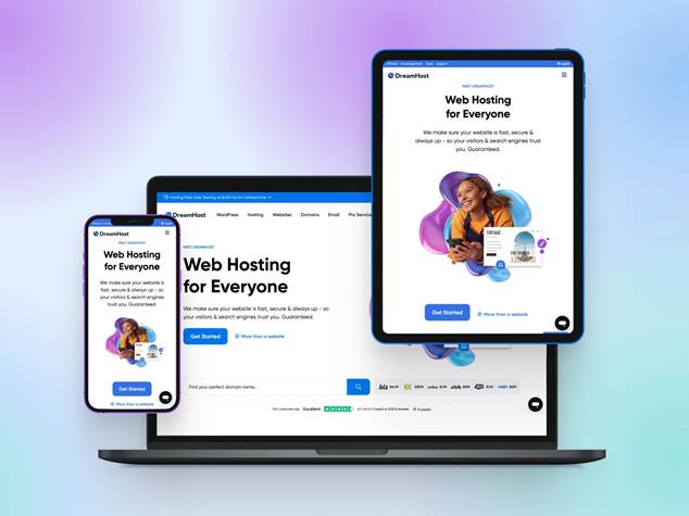
Responsive web design example showing the same website displayed on mobile, tablet, and desktop screens.
HTML srcset ও sizes এট্রিবিউটের ব্যবহার
srcset এট্রিবিউট
<img src=”default-image.jpg”
srcset=”small-image.jpg 480w,
medium-image.jpg 800w,
large-image.jpg 1200w”
alt=”ইমেজের বর্ণনা”>
এই কোডে srcset এট্রিবিউট বিভিন্ন রেজোলিউশনের ইমেজ ফাইল নির্দিষ্ট করে। w ইউনিট দিয়ে প্রতিটি ইমেজের প্রস্থ বোঝানো হয়।[3][4][5]
sizes এট্রিবিউট
<img srcset=”image-480w.jpg 480w,
image-800w.jpg 800w,
image-1200w.jpg 1200w”
sizes=”(max-width: 600px) 480px,
(max-width: 1024px) 800px,
1200px”
src=”image-800w.jpg”
alt=”রেসপনসিভ ইমেজ”>
sizes এট্রিবিউট ব্রাউজারকে জানিয়ে দেয় যে বিভিন্ন স্ক্রিন সাইজে ইমেজটি কত প্রস্থে প্রদর্শিত হবে[4][5][6]।
Picture এলিমেন্টের প্রয়োগ
আর্ট ডিরেকশনের জন্য Picture ব্যবহার
<picture>
<source media=”(max-width: 600px)”
srcset=”mobile-image.jpg”>
<source media=”(max-width: 1024px)”
srcset=”tablet-image.jpg”>
<img src=”desktop-image.jpg”
alt=”মূল ইমেজ”>
</picture>
Picture এলিমেন্ট ব্যবহার করে আমরা বিভিন্ন স্ক্রিন সাইজের জন্য সম্পূর্ণ ভিন্ন কম্পোজিশনের ইমেজ প্রদান করতে পারি। এটি বিশেষভাবে উপকারী যখন ছোট স্ক্রিনে মূল বিষয়বস্তু স্পষ্টভাবে দেখানোর জন্য ক্রপ করা ইমেজ প্রয়োজন।[3][7][8]
ইমেজ অপটিমাইজেশনের মূল নীতি

How to optimize website images for faster loading by resizing and reducing their file size.
ফাইল ফরম্যাট নির্বাচন
বিভিন্ন ফাইল ফরম্যাটের নিজস্ব সুবিধা রয়েছে:[2][9]
· JPEG: ফটোগ্রাফের জন্য উপযুক্ত, ছোট ফাইল সাইজ
· PNG: স্বচ্ছতা প্রয়োজন হলে ব্যবহার করুন
· WebP: আধুনিক ব্রাউজারে ভালো কম্প্রেশন
· AVIF: সর্বাধুনিক ফরম্যাট, সর্বোচ্চ কম্প্রেশন[10]
রেজোলিউশন ও কোয়ালিটি ব্যালেন্সিং
ইমেজ অপটিমাইজেশনের মূল লক্ষ্য হলো কোয়ালিটি বজায় রেখে ফাইল সাইজ যথাসম্ভব কমানো। ব্লগ সাইটের জন্য সাধারণত ১২৮০×৭২০ রেজোলিউশনের মধ্যে রাখা ভালো।[9][11][12]
ব্যবহারিক প্রয়োগের সুবিধা
ব্যান্ডউইথ সাশ্রয়
ছোট ডিভাইসে বড় ইমেজ লোড করার প্রয়োজন নেই। মোবাইল ব্যবহারকারীরা ৬৪.৩ কিলোবাইটের ইমেজ পাবেন যেখানে ডেস্কটপ ব্যবহারকারীরা ৩৩৬ কিলোবাইটের ইমেজ পাবেন।[4][8]
পেজ লোডিং স্পিড উন্নতি
সঠিক ইমেজ অপটিমাইজেশন পেজ লোডিং টাইম উল্লেখযোগ্যভাবে কমায়। এটি SEO র্যাঙ্কিং এবং ব্যবহারকারীর অভিজ্ঞতা উভয়ের জন্যই গুরুত্বপূর্ণ।[2][9][11]
ডিভাইস অভিযোজনযোগ্যতা
আধুনিক ব্রাউজারগুলো স্বয়ংক্রিয়ভাবে ডিভাইসের ক্ষমতা অনুযায়ী সর্বোত্তম ইমেজ নির্বাচন করে। উচ্চ রেজোলিউশনের ডিসপ্লেতে তীক্ষ্ণ ইমেজ এবং সাধারণ ডিসপ্লেতে অপটিমাইজড ইমেজ প্রদান করা হয়।[3][4][5]
কার্যকর অনুশীলন
সর্বোত্তম ফলাফলের জন্য কমপক্ষে ১২টি ভিন্ন ইমেজ সাইজ ব্যবহার করা উচিত। এটি ব্রাউজারকে সবচেয়ে নির্ভুল নির্বাচন করতে সাহায্য করে। Picture এলিমেন্ট এবং srcset এট্রিবিউট একসাথে ব্যবহার করে আমরা বিভিন্ন পরিস্থিতিতে সর্বোত্তম ইমেজ প্রদান নিশ্চিত করতে পারি।[3][8][10]
স্ক্রিন টাইপ অনুযায়ী ইমেজ অপটিমাইজেশন আধুনিক ওয়েব ডেভেলপমেন্টের একটি অপরিহার্য অংশ। সঠিক কৌশল প্রয়োগ করে আমরা ব্যবহারকারীদের জন্য দ্রুত ও কার্যকর ওয়েব অভিজ্ঞতা নিশ্চিত করতে পারি।
⁂
1. https://www.w3schools.com/howto/howto_css_image_responsive.asp
2. https://lutforpro.com/bangla/ইমেজ-এসইও-কি-ও-কিভাবে-করবে/
3. https://developer.mozilla.org/en-US/docs/Web/HTML/Guides/Responsive_images
4. https://uploadcare.com/blog/srcset-images/
5. https://web.dev/learn/design/responsive-images
6. https://amp.dev/documentation/guides-and-tutorials/develop/style_and_layout/art_direction/
7. https://www.nbp3bangla.com/html/html-image-pictureElement.php
8. https://kivabe.com/codes/html/html-picture/
9. https://www.1timeschool.com/2022/03/image-optimizatio.html
10. https://docs.imgix.com/getting-started/tutorials/responsive-design/responsive-images-with-srcset
11. https://writersmotion.com/blog/image-optimization/
12. https://trickbd.com/seo-tricks/860303
13. https://play.google.com/store/apps/details/8K_Wallpapers_HD_QHD_UDH?id=com.app.Eightkwallpaper&hl=bn
14. https://www.istockphoto.com/photos/4k-screen
15. https://www.linkedin.com/learning/html-essential-training-22425519/responsive-images-with-picture
16. https://www.gettyimages.com/photos/lcd-screen
17.
18. https://www.shutterstock.com/search/big-resolution
19.
20. https://hoicoibangla.com/১০টি-ইমেজ-অপটিমাইজেশন-টি/
21. https://unsplash.com/images/stock/high-resolution
22.
23.
24. https://www.freepik.com/free-photos-vectors/beautiful-screen-resolutions
25. https://sattacademy.com/skill/responsive-images-তৈরি-করা
26. https://www.linkedin.com/pulse/ইমজ-অপটমইজশন-এর-কছ-গরতবপরণ-টপস-sharif-ullah
27.
28. https://wigmarketing.com/html-attributes-in-bangla/
29.
30. https://cloudinary.com/blog/responsive_images_with_srcset_sizes_and_cloudinary
31. https://www.webcoachbd.com/html-tutorials/html-font
32. https://www.webcoachbd.com/html-tutorials/html-images
33. https://dev.to/activenode/srcset-sizes-picture-media-what-you-might-not-have-known-31nf
34. https://www.linkedin.com/learning/html-images-and-figures/using-srcset-and-sizes
35. https://jhutanda.com/এইচটিএমএল-ছবির-উপাদান-the-html-picture-element/
36.
37. https://stackoverflow.com/questions/38598394/responsive-images-srcset-sizes
38. https://freelancerstutorial.wordpress.com/সহজে-শিখুন-এইচটিএমএল/