





HTML में रेस्पॉन्सिव इमेज: स्मार्ट वेब डेवलपमेंट

HTML code snippet showing the use of srcset attribute for responsive images with different resolutions.
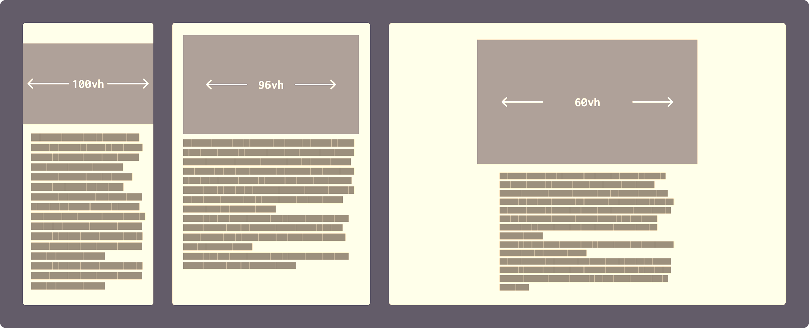
आजकल की डिजिटल दुनिया में, हर वेबसाइट को अलग-अलग डिवाइस पर बेहतर तरीके से दिखना जरूरी है। हमारी समझदारी भरी अगली चाल HTML की ताकतवर खूबियों का समझदारी से इस्तेमाल करना है। हम अलग-अलग स्क्रीन साइज के लिए अलग-अलग इमेज फाइल्स भेज सकते हैं।

HTML की रेस्पॉन्सिव इमेज तकनीक

Common screen sizes for mobile, tablet, and desktop devices.
हमारे पास कई वर्ज़न बनाने और उन्हें अपने HTML कोड में एक विकल्प सेट की तरह व्यवस्थित रूप से लिस्ट करने की पूरी सुविधा मौजूद है। इससे ब्राउज़र खुद तय कर सकता है कि कौन-सी इमेज फाइल डाउनलोड करने के लिए सबसे सही और उपयुक्त रहेगी।[1][2][3]
srcset और sizes एट्रिब्यूट का इस्तेमाल
<img
src=”image-default.jpeg”
srcset=”image-480w.jpeg 480w,
image-800w.jpeg 800w,
image-1200w.jpeg 1200w”
sizes=”(max-width: 600px) 480px,
(max-width: 1024px) 800px,
1200px”
alt=”रेस्पॉन्सिव इमेज का उदाहरण” />
इस कोड में ब्राउज़र अलग-अलग स्क्रीन साइज के लिए अलग-अलग इमेज चुनता है। अगर व्यूपोर्ट 600px या उससे कम है, तो 480w इमेज लोड होगी। 600px से 1024px के बीच में 800w वर्ज़न, और 1024px से बड़े स्क्रीन के लिए 1200w इमेज मिलेगी।[1][2][4]
Picture एलिमेंट: एडवांस कंट्रोल

Infographic showing various device screen sizes and corresponding responsive web design layouts.
Picture एलिमेंट हमें और भी ज्यादा कंट्रोल देता है। यह एक से अधिक source एलिमेंट्स को शामिल कर सकता है:[3][5][6]
<picture>
<source media=”(min-width: 650px)” srcset=”img_desktop.jpg”>
<source media=”(min-width: 465px)” srcset=”img_tablet.jpg”>
<img src=”img_mobile.jpg” alt=”रेस्पॉन्सिव डिज़ाइन”>
</picture>
यह तकनीक ब्राउज़र को पहले source एलिमेंट को देखने का मौका देती है जो वर्तमान व्यूपोर्ट चौड़ाई से मेल खाता है।[6][3]
परफ़ॉर्मेंस और बैंडविड्थ के फायदे

Illustration showing network speed measurement and webpage loading progress.
यह फैसला ऑपरेटिंग सिस्टम की मदद से होता है, और साथ ही डिवाइस के हार्डवेयर और सबसे ज़रूरी—नेटवर्क की मौजूदा स्पीड को भी ध्यान में रखता है।[7][8][9]
मोबाइल डिवाइसेज के लिए फायदे
रेस्पॉन्सिव इमेज का सबसे बड़ा फायदा मोबाइल यूज़र्स को मिलता है। जब एक 300 KB का 1200px चौड़ा इमेज मोबाइल पर केवल 480px में दिखाना हो, तो ब्राउज़र छोटा वर्ज़न डाउनलोड करता है, जो सिर्फ 64.3 KB का होता है। यह 70-90% तक बैंडविड्थ की बचत करता है।[1][7][9][10]
बेस्ट प्रैक्टिसेज और टिप्स

Different devices with varied screen sizes and resolutions demonstrating aspect ratios.
सही इमेज साइज चुनना
विशेषज्ञ सलाह देते हैं कि अधिकतम 2560px तक का इमेज साइज पर्याप्त है। सामान्यतः निम्नलिखित साइजेज का इस्तेमाल करें:[2]
· 480px (मोबाइल के लिए)
· 800px (टैब्लेट के लिए)
· 1200px (डेस्कटॉप के लिए)
· 2560px (हाई-रेज़ोल्यूशन डिस्प्ले के लिए)[11][2]
फ़ॉर्मेट और कम्प्रेशन
WebP और AVIF जैसे मॉडर्न फ़ॉर्मेट बेहतर कम्प्रेशन देते हैं। Picture एलिमेंट के साथ फ़ॉलबैक भी सेट कर सकते हैं:[12][9][13]
<picture>
<source type=”image/avif” srcset=”image.avif”>
<source type=”image/webp” srcset=”image.webp”>
<img src=”image.jpg” alt=”इमेज”>
</picture>
नेटवर्क एडाप्टिव लोडिंग

Illustration of a laptop with a loading screen and a speed gauge highlighting website loading speed.
आधुनिक तकनीकों में ब्राउज़र नेटवर्क स्पीड के आधार पर इमेज क्वालिटी को एडजस्ट कर सकता है। धीमे 3G कनेक्शन पर कम क्वालिटी वाली इमेज (38.3 KB) और तेज़ WiFi पर बेहतर क्वालिटी वाली इमेज (60 KB) अपने आप सेलेक्ट होती है।[14][15]
SEO और यूजर एक्सपीरियंस के फायदे
रेस्पॉन्सिव इमेज से कई फायदे मिलते हैं:
· पेज लोडिंग स्पीड में 52% तक सुधार[7]
· बेहतर SEO रैंकिंग[9]
· मोबाइल यूज़र्स के लिए बेहतर एक्सपीरियंस[9]
निष्कर्ष
HTML की रेस्पॉन्सिव इमेज तकनीक वेब डेवलपमेंट में एक क्रांतिकारी बदलाव है। यह न केवल बैंडविड्थ बचाती है बल्कि यूजर एक्सपीरियंस को भी बेहतर बनाती है। आज के समय में, जब मोबाइल ट्रैफिक 50% से अधिक है, रेस्पॉन्सिव इमेज का इस्तेमाल करना अनिवार्य हो गया है।[16]
srcset, sizes और picture एलिमेंट जैसी तकनीकों का सही इस्तेमाल करके हम ऐसी वेबसाइट बना सकते हैं जो हर डिवाइस पर परफेक्ट दिखती है और तेज़ी से लोड होती है।
<div style=”text-align: center”>⁂</div>
1. https://uploadcare.com/blog/srcset-images/
2. https://dev.to/razbakov/responsive-images-best-practices-in-2025-4dlb
3. https://www.w3schools.com/html/html_images_picture.asp
4. https://developer.mozilla.org/en-US/docs/Web/HTML/Guides/Responsive_images
5. https://whoisguilty.com/developers/responsive_images/picture_tag
6. https://www.w3schools.com/tags/tag_picture.asp
7. https://imagify.io/blog/make-responsive-images/
8. https://imagekit.io/blog/automatic-best-image-format-selection/
9. https://visualmodo.com/5-reasons-to-use-responsive-images-on-your-website/
10. https://css-tricks.com/a-guide-to-the-responsive-images-syntax-in-html/
11. https://www.debugbear.com/blog/responsive-images
12. https://www.geeksforgeeks.org/html/how-to-optimize-images-for-faster-loading-in-html/
13. https://developer.mozilla.org/en-US/blog/fix-image-lcp/
14. https://tpiros.dev/blog/adaptive-image-loading-based-on-network-speed/
15. https://www.greatfrontend.com/blog/image-performance-techniques
16. https://imageengine.io/how-many-image-variants-are-needed-for-responsive-images/
17. https://scottwillsey.com/picture-sizes/
18. https://stackoverflow.com/questions/72586177/responsive-images-different-sizes
19. https://www.w3schools.com/css/css_rwd_images.asp
20. https://www.reddit.com/r/webdev/comments/7pwegk/how_many_images_do_you_create_for_responsive/
21. https://web.dev/learn/design/picture-element
22. https://web.dev/learn/design/responsive-images
23. https://www.dhiwise.com/post/html-picture-element-enhancing-web-design-for-multiple-devices
24. https://developer.mozilla.org/en-US/docs/Web/HTML/Reference/Elements/picture
25. https://www.w3schools.com/html/html_responsive.asp
26. https://stackoverflow.com/questions/68191793/specify-explicit-width-and-height-for-picture-tag
27. https://www.w3schools.com/tags/att_source_srcset.asp
28. https://claritee.io/blog/a-designers-definitive-guide-to-responsive-images/
29. https://filterpixel.com/culling
30. https://stackoverflow.com/questions/12884402/auto-resize-image-to-fit-the-browser
32. https://cloudinary.com/guides/image-effects/html-image-optimization
33. https://cloudinary.com/blog/how_to_automatically_create_images_for_responsive_design
34. https://nitropack.io/blog/post/image-optimization-for-the-web-the-essential-guide
35. https://applitools.com/docs/autonomous/content/topics/environmets.htm
36. https://css-tricks.com/optimizing-images-for-users-with-slow-network-speeds/
37. https://web.dev/learn/performance/image-performance
38. https://www.browserstack.com/guide/how-to-test-responsive-images