


HTML দিয়ে স্মার্ট ইমেজ ডেলিভারি কৌশল

আধুনিক ওয়েব ডেভেলপমেন্টে ছবির অপ্টিমাইজেশন একটি অত্যন্ত গুরুত্বপূর্ণ বিষয়। বিভিন্ন ডিভাইসে একই ওয়েবসাইট দেখার সময় ব্যবহারকারীরা ভিন্ন ভিন্ন অভিজ্ঞতার সম্মুখীন হন। একটি বড় মনিটরে যে ছবি দেখতে সুন্দর লাগে, সেটাই মোবাইল ফোনে অপ্রয়োজনীয়ভাবে বেশি ডেটা খরচ করতে পারে।

HTML code snippet showing responsive image markup with srcset and sizes attributes for optimal image delivery.
বুদ্ধিদীপ্ত সমাধান: Responsive Images
HTML-এর শক্তিশালী ফিচার ব্যবহার করে আমরা এই সমস্যার একটি কার্যকর সমাধান পেতে পারি। Responsive Images কৌশল ব্যবহার করে বিভিন্ন স্ক্রিন সাইজের জন্য আলাদা আলাদা ছবি তৈরি করা সম্ভব। এতে ব্রাউজার স্বয়ংক্রিয়ভাবে সবচেয়ে উপযুক্ত ছবিটি নির্বাচন করে নেয়।

HTML code snippet showing the use of srcset to specify multiple image sizes for responsive loading.
HTML5 Picture Element এর ব্যবহার
HTML5-এর <picture> এলিমেন্ট এবং srcset অ্যাট্রিবিউট ব্যবহার করে আমরা একাধিক ইমেজ ভার্সন প্রদান করতে পারি। ব্রাউজার নিম্নলিখিত বিষয়গুলো বিবেচনা করে সঠিক ছবি নির্বাচন করে:
মূল বিবেচ্য বিষয়সমূহ
স্ক্রিন রেজোলিউশন: ডিভাইসের স্ক্রিন সাইজ এবং পিক্সেল ডেন্সিটি অনুযায়ী উপযুক্ত ছবির আকার নির্বাচন
নেটওয়ার্ক স্পিড: ব্যবহারকারীর ইন্টারনেট সংযোগের গতি অনুযায়ী ছোট বা বড় ছবি লোড করা
ডিভাইসের হার্ডওয়্যার: প্রসেসিং পাওয়ার এবং মেমরি সীমাবদ্ধতা বিবেচনা করা

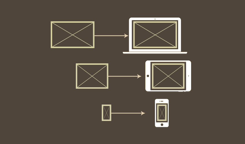
Responsive web design shown with desktop, tablet, and smartphone layouts and corresponding CSS media queries for adapting screen sizes.
কোড উদাহরণ
<picture>
<source media=”(max-width: 480px)” srcset=”mobile-image.jpg”>
<source media=”(max-width: 768px)” srcset=”tablet-image.jpg”>
<source media=”(min-width: 769px)” srcset=”desktop-image.jpg”>
<img src=”default-image.jpg” alt=”রেসপন্সিভ ছবি”>
</picture>
Srcset অ্যাট্রিবিউটের সুবিধা
srcset অ্যাট্রিবিউট ব্যবহার করে আমরা একই ছবির বিভিন্ন রেজোলিউশনের ভার্সন প্রদান করতে পারি:
<img src=”default.jpg”
srcset=”small-320w.jpg 320w,
medium-640w.jpg 640w,
large-1280w.jpg 1280w”
sizes=”(max-width: 320px) 280px,
(max-width: 640px) 600px,
1200px”
alt=”অভিযোজনযোগ্য ছবি”>
পারফরম্যান্স বৃদ্ধির উপায়
ব্যান্ডউইথ সাশ্রয়: ছোট ডিভাইসে ছোট ছবি পাঠিয়ে ডেটা সাশ্রয় করা যায়
লোডিং টাইম হ্রাস: উপযুক্ত সাইজের ছবি দ্রুত লোড হয়
ব্যবহারকারীর অভিজ্ঞতা উন্নতি: প্রতিটি ডিভাইসে সর্বোত্তম ভিজ্যুয়াল কোয়ালিটি নিশ্চিত করা
বাস্তবায়নের পরামর্শ
একাধিক ইমেজ ফরম্যাট: WebP, AVIF এর মতো আধুনিক ফরম্যাট ব্যবহার করুন
সঠিক রেজোলিউশন: সাধারণ ব্রেকপয়েন্টগুলোর জন্য আলাদা ভার্সন তৈরি করুন
ফলব্যাক সমাধান: পুরাতন ব্রাউজারের জন্য ডিফল্ট ছবি রাখুন
HTML-এর এই শক্তিশালী ফিচারটি ব্যবহার করে আমরা একটি স্মার্ট এবং দক্ষ ওয়েবসাইট তৈরি করতে পারি, যা প্রতিটি ডিভাইসে সর্বোত্তম পারফরম্যান্স প্রদান করবে। এই কৌশল ব্যবহারকারীর সন্তুষ্টি বৃদ্ধির পাশাপাশি সার্ভারের লোডও কমাতে সাহায্য করে।
<div style=”text-align: center”>⁂</div>